Let`s discuss few different image usage patterns, and their relevant CSS.
In all cases, we assume source image size is different from the div we want it to be in the page, and that aspect-ratio must remain.
- Full site background image (all-page width and height)
- Full width but small-height header/middle-page image, common in bootstrap templates.
- User image by itself, sometimes with circle around it
- User image inside a gallery of images, where we have known X images in each row, but almost infinite number of scrolling rows.
good start at: http://www.w3schools.com/css/css3_backgrounds.asp
Full site background image (all-page width and height)
.your-div-class {
background-size: cover;
background: url(splash-bunny.jpg) no-repeat center center;
}
Few notes:
1. "background-size: cover" expects your image to be always greater than the size of the div. So if your max target size is Samsung note 2 (720x1280), make sure that your image is equal or bigger than that. If not, the image will be at it`s maximum size on the center of the page, which you don`t want!
2. Cover will only show a fraction of your image, think of it as a "sliding-window" above your image. Ask your art dude to make sure the important stuff is in one postion, so that users with small screen can still understand it. It is common to put the important stuff in the center of the image, and then use "center center".
If the important stuff is on the top left, use "top left", see this lovely bunny:
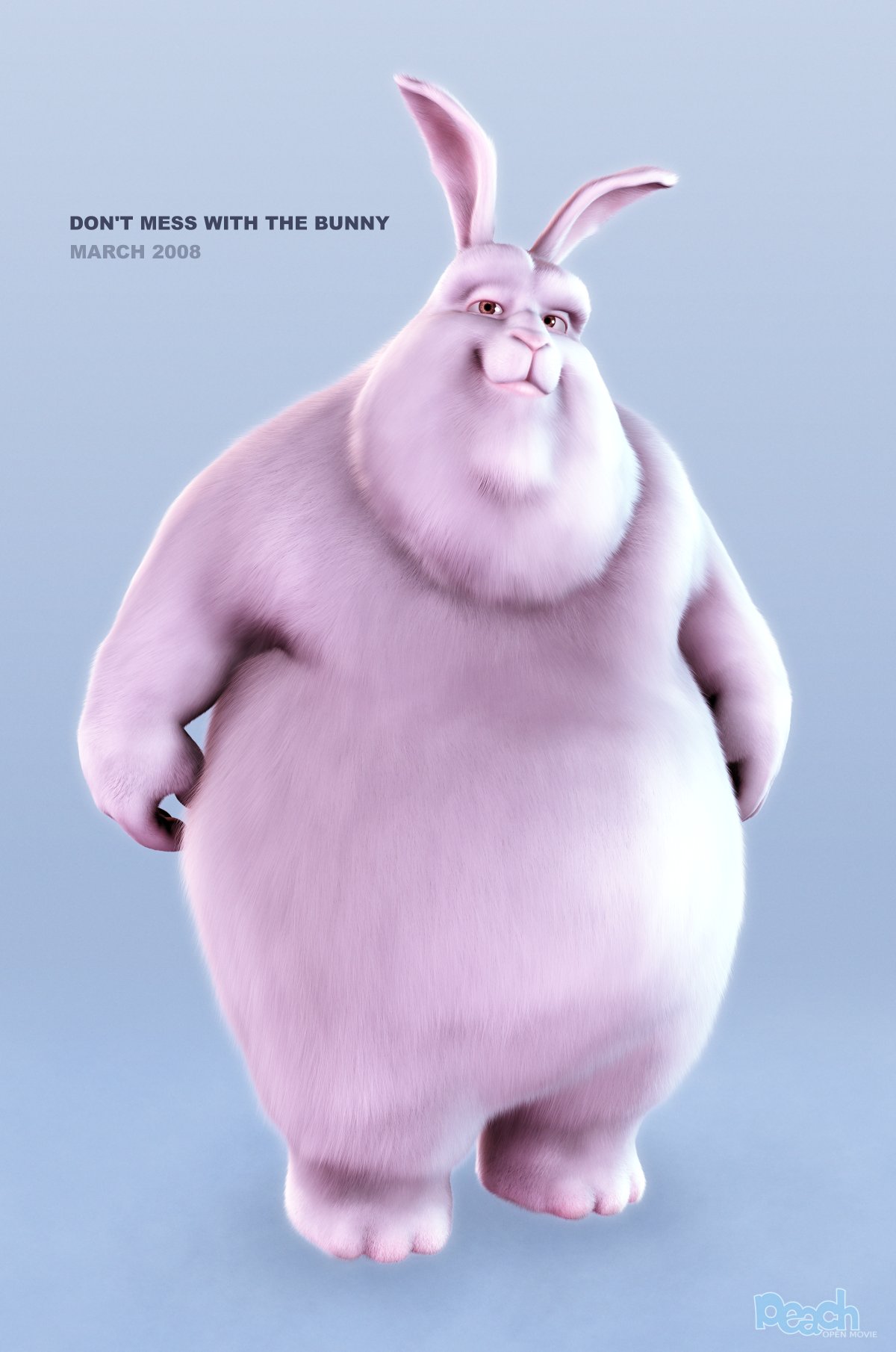
If you use "center center", on small screens you will only see his pink belly, and no one will understand what the cover image means.
If you use the "top center" , even on narrow screen, the bunny face will be shown (but the right/left side of it will not)
If you use the "top left" , on narrow screens, only the text will be shown.
If you use "center bottom" the feet will always be shown, but on small devices (and landscapes) the head will not.
3. This css does not make your div as big as the screen, this is your job. I won't get into it , but only for pure testing, try min-height: -large-number-like-1800px;
Full width but small-height header/middle-page image, common in bootstrap templates.
see above, just one change: reduce the height of your div to be what ever you like.
User image by itself, sometimes with circle around it
If your div and your user-image aspect-ratio are the same (200x200 against 100x100 image source or 500x500 image-source. this is trivial (use either contain or cover).
If your div is a square and the user-image is not, you can use 'cover' and then choose the right top/bottom/center right/left/center, to catch the user face. in the bunny above top-center is best, but it will still show the text on the left and some of the belly.
Lot of sites allow the user to choose an crop a square. When the user is doing it you can actually crop the image and generate a new one.
Making it circle is as easy as adding: border-radius:50% 50% 50% 50%;
Note: Make sure, again, that the image size is BIGGER than the div size. cover will not work otherwise.
No comments:
Post a Comment